
In the past we've told you how fonts are made in "The Story of a Font ". Now, here is the story of how a logo is made. It was suggested by our good friend Andrew Wright from the Rockford chapter of the Red Cross that TL Technological needed a new logo. I hadn't given it much thought and liked the first one I came up with even though it was a little bit complicated:

Andrew insisted that simpler was better. After thinking it over and a few hours on the computer I decided to use an offshoot of the logo we used for the TL2 CD from Mule Dog Records.

Back to the drawing board: Since the TL2 CD pattern wouldn't work I settled on a bold new size and shape for the letters that would allow the TL to stand out more and be recognizable as what it was. Fortunately when I started Mule Dog Records I had bought the Adobe Woodtype Fonts so I had all of them at my disposal. I set the size, created a small field and then cut a circle encompassing a single TL. Unfortunately the TL pattern created an optical illusion and I had to spend an extra hour or so creating false sections to create the shape of a nice round circle.


 |
 |
 |
 |
||||||
|
||||||||||||||||||||||||||||||||||||||||
The |
||||||||||||||||||||||||||||||||||||||||
|
|
|||||||||||||||||||||||||||||||||||||||
|
||||||||||||||||||||||||||||||||||||||||
|
|
|
||||||||||||||||||||||||||||||||||||||
T
|
||||||||||||||||||||||||||||||||||||||||
|
||||||||||||||||||||||||||||||||||||||||
 |
Back to the index
|
|||||||||||||||||||||||||||||||||||||||
 |
|
|||||||||||||||||||||||||||||||||||||||
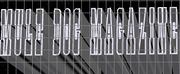
| Mule Dog Records | Mule Dog Web Design | TL Technological | Index Of All Issues | |||||||||||||||||||||||||||||||||||||
| WWeb Design by: | ||||||||||||||||||||||||||||||||||||||||
 |
||||||||||||||||||||||||||||||||||||||||
| Mailing List | ||||||||||||||||||||||||||||||||||||||||
 |
||||||||||||||||||||||||||||||||||||||||
| muledog@muledog.com | ||||||||||||||||||||||||||||||||||||||||
| All contents copyright ©2005 Mule Dog all rights reserved. The Mule Dog is a Registered ® Trademark. | ||||||||||||||||||||||||||||||||||||||||